


New logo, new identity for Devilish Tattoo
Since its beginnings, Devilish Tattoo has evolved alongside the world of tattooing and piercing. Our catalogue has expanded, our website has grown, and our identity has become stronger over the years. Today, a new chapter begins with the launch of our new Devilish Tattoo logo.
This change in visual identity does not mark a break from our history. On the contrary, this new logo builds on the elements that are part of Devilish Tattoo’s DNA, while giving them a more modern, more readable look that is better suited to the different platforms and formats where our brand is now present.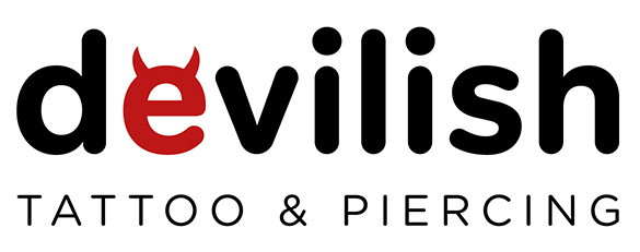
A new identity, still unmistakably Devilish
In 2026, Devilish Tattoo adopts a cleaner, more modern identity that is better suited to today’s digital uses. This new version retains the spirit of the brand while giving it a stronger and more easily recognisable image. We also wanted to keep a logo that is instantly identifiable and full of character, without falling into the overly traditional graphic codes of the tattoo world.
The new logo is therefore based on a typeface with rounded shapes. The word Devilish retains a strong presence, while becoming simpler and easier to read. The result is a more contemporary identity, designed for our online store as well as our social media channels, packaging, professional documents and future communication materials.
Below the Devilish name now appears the signature "Tattoo & Piercing".
The red "e" becomes the distinctive symbol of Devilish Tattoo
At the heart of this new identity is one particularly important element: the red "e" in Devilish.
With its small horns, it directly refers to the Devilish name and its universe. It is a deliberately simple and confident nod to the brand’s "devilish" side, without the need to add a complex symbol or an additional illustration.
This "e" has also been designed to work independently from the full logo. It can therefore become a true symbol of the brand and be used across a wide range of applications: website icon, favicon, social media, stickers, packaging and other graphic communication elements.
Red and black naturally remain at the heart of the Devilish Tattoo identity.
Black brings a clean, professional and timeless dimension, while red adds energy and immediately draws the eye. Together, these two colours create a strong contrast that makes the logo easy to identify.
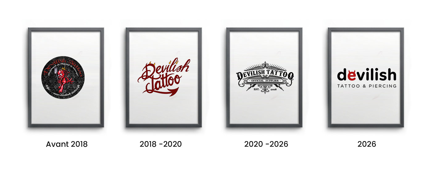
The evolution of the Devilish Tattoo logo over the years
Our visual identity has gone through several changes throughout the history of Devilish Tattoo. Each version of the logo reflects a stage in the development of the brand.
New logo, same passion
While our logo is evolving, our goal remains the same: to keep growing Devilish Tattoo and to offer an increasingly complete experience to tattoo and piercing professionals.
This new identity represents a new chapter in our story, while remaining true to what has defined Devilish from the very beginning: character, a strong identity and an unchanged passion for the world of tattooing and piercing.
We hope you will like this new face of Devilish Tattoo, and we look forward to bringing it to life across all our platforms and communication materials.